Overview
As the team at Dealersocket grew larger, inconsistencies were spotted more frequently, and team members often referred to older screens due to uncertainty about their reliability. After discovering these design inconsistencies, a need for knowledge sharing, and a requirement for device theming, I believed it was a good time to consider a design system. I proposed a process to implement a design system.
My contribution
Conducted a comprehensive audit of design assets to identify inconsistencies and improvement areas.
Defined the design system's principles, including color palettes, typography, and layout grids.
Implemented design tokens to address spacing inconsistencies and support scalability and theming.
Documented the design system, detailing foundations and reusable UI components for consistent implementation.
Validated the design system through user testing, significantly improving design efficiency and accuracy.
Year
2022

Process
My proposed process consisted of these steps.
Audit
Define design system
Build design system - Integrate tokens, variables, and styles
Document and manage system
Test and gather feedback
Audit
Initially, I was uncertain about whether a design system was right for the team. After all, a design system requires consistent time and effort, not only to implement but also to maintain. While they require investment, it might be a while before we see the results of our efforts. Therefore, I decided to conduct a full audit of Dealersocket’s products and identify opportunities and areas of improvement to convince upper management. The audit was broken down into three phases:
Gathering Everything: Collected all existing design assets and files.
Sorting and Organizing: Organized the collected assets to identify patterns and inconsistencies.
Identifying Opportunities: Noted issues like lack of version control, where files were passed around by designers and developers leading to wrong versions being used, and the need to update to new branding elements.


Define the Design System
After presenting the current issues and identifying opportunities I received the green light to start with the design system. First, I established the principles and foundations for the design system, which included defining color palettes, typography scales, iconography, and layout grids. The team focused on simplifying the color palette and setting up a typography system to create a consistent and accessible design language.

Build the Design System
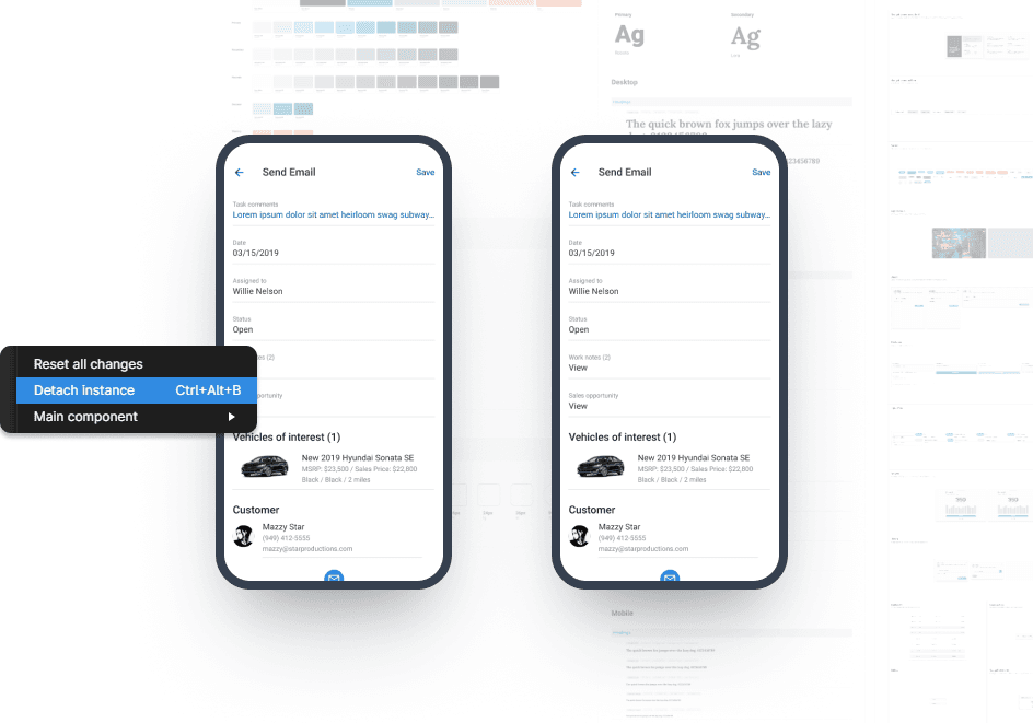
Once the foundations were set, I explored the use of design tokens to support scalability. Dealersocket’s product suite was evolving, and there were new challenges to address:
Spacing Inconsistencies: The spatial system sped up the design process and solved alignment issues, but tracking border radius and spacing values was challenging, leading to inconsistent user experiences.
Team Growth: With new teammates and features, a more efficient way to manage changes and improve accuracy during handoffs was needed.
Theming: To ease tired eyes from dealing with a complex SaaS, the team wanted to add a dark theme.
After realizing the benefits, I successfully convinced the team to implement design tokens. I structured the design tokens into three categories:
Primitive: Defined colors, spacing, and radius values.
Semantic: Mapped primitives to semantic tokens via aliasing in the Components category.
Component-Specific: Drilled down in each component category (e.g., Buttons) to define states like Default, Hover, and Active.
With the token structure in place, our design system became scalable and efficient.


Documentation
Since the team was small and the design system was a work in progress, we kept the documentation in a separate file. I created detailed pages covering various aspects of the design system. The "Foundations" section included essential elements such as spacing, typography, and colors, ensuring a consistent visual language across our designs. Additionally, the "Components" section documented the reusable UI elements like buttons, cards, toggles, and more, providing clear guidelines for their implementation and usage.
Outcome
I conducted user testing to validate the effectiveness of the design system. This included having designers recreate screens with and without the design system to measure efficiency and identify issues. The team found that tasks were completed significantly faster with the design system in place and used this feedback to refine their components.
Get in touch
Have a project in mind?
If you want to chat about a project, opportunity, or anything really — just send me an email on hi@brettchien.com.
Currently based in California — available for remote-friendly work.
©2024 Brett Chien